In the ever-evolving digital marketing landscape, landing pages have emerged as indispensable tools for driving conversions, capturing leads, and enhancing user engagement. A well-crafted landing page can serve as a virtual gateway, guiding visitors towards a specific action that aligns with the marketer's goals.
This article delves into the realm of Top Landing Page Examples, exploring their significance design principles, and providing real-world examples across different categories. Whether you're in e-commerce, lead generation, or app promotion, we'll uncover the strategies that elevate landing pages to greatness.
In the digital age, where attention spans are fleeting, and choices are abundant, landing pages play a pivotal role in capturing and retaining user interest. The best landing page is purposefully designed to lead visitors towards a particular conversion goal: making a purchase, subscribing to a newsletter, registering for a webinar, or downloading an app. Unlike the cluttered environment of a website, a well-optimized landing page serves as a focused destination, eliminating distractions and presenting the visitor with a clear path to action.
Creating an effective landing page is an art that involves a harmonious blend of design, psychology, and strategic messaging. Several key elements contribute to the success of a landing page:
Landing Page Design Principles
-
Clear and Compelling Headline
The headline is the hook that captures a visitor's attention within seconds. It should be concise, relevant, and convey the core value proposition. A strong headline instantly communicates the offer and why it matters to the visitor.
-
Engaging and Relevant Visuals
Visual content speaks volumes and can significantly enhance user engagement. High-quality images, videos, and graphics that align with the message can convey emotions, create a connection, and make the content more memorable.
-
Well-crafted copy and Persuasive Messaging
The body copy should expand on the headline's promise and provide details that resonate with the target audience. Employ persuasive language that highlights benefits, addresses pain points, and instils a sense of urgency.
-
Prominent Call-to-Action (CTA) Buttons
The call-to-action button is the linchpin of a landing page. It should stand out visually, utilize action-oriented text, and clearly state the desired action. Employ contrasting colors to draw attention and guide the user's eye.
-
User-Friendly and Intuitive Layout
A clutter-free layout contributes to a seamless user experience. Use ample white space, logical flow, and intuitive navigation to guide visitors effortlessly towards the CTA.
E-commerce Landing Page Examples
A. Product-Focused Landing Pages
- Highlighting a Single Product with Detailed Descriptions and Visuals
Consider the example of an e-commerce landing page showcasing a high-end watch. The page features striking images from various angles and detailed descriptions highlighting the watch's craftsmanship, materials, and unique features.
Casper.com provides the finest illustration of a landing page featuring these attributes.

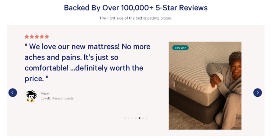
- Incorporating Customer Reviews and Testimonials
To establish credibility, integrate genuine customer reviews and testimonials. Positive feedback and endorsements can alleviate doubts and encourage potential buyers to purchase.
B. Promotion-Driven Landing Pages
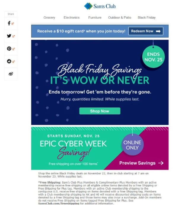
- Showcasing Limited-Time Offers, Discounts, or Sales Landing Page
Imagine a landing page promoting a flash sale on electronic gadgets. The page highlights the limited-time nature of the offer, emphasizing the savings customers can avail of by acting quickly.
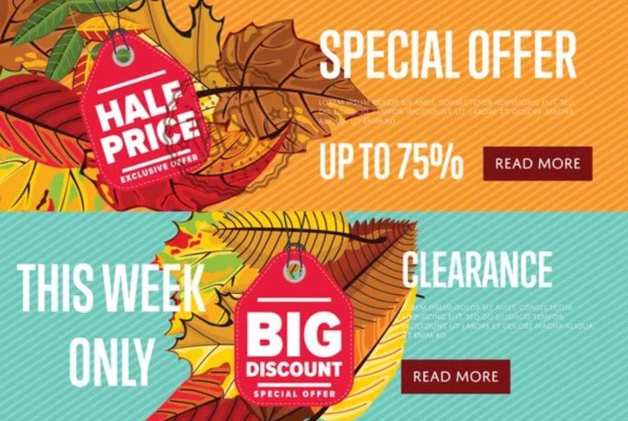
- Creating a Sense of Urgency to Encourage Immediate Action
By incorporating countdown timers and urgent language, such as "Act now!" or "Limited stock available," marketers can stimulate a fear of missing out (FOMO) that drives immediate conversions.
Lead Generation Landing Page Examples
A. Email Capture Landing Pages
- Offering Valuable Content in Exchange for Email Addresses
A lead generation page for a digital marketing course could offer a free e-book on "Effective SEO Strategies." Visitors are enticed to provide their email addresses to access this valuable resource.
- Using Compelling Copy and Visuals to Entice Visitors to Subscribe
Concise and benefit-driven copy and appealing visuals can convince visitors that subscribing will provide valuable insights and solve their pain points.
B. Webinar Registration Landing Pages
- Outlining the Webinar's Benefits and Key Takeaways
A webinar landing page should outline the topics to be covered, the expertise of the presenter, and the key takeaways participants can expect, building anticipation and demonstrating value.
- Simplifying the Registration Process to Encourage Sign-Ups
A streamlined registration form that only asks for essential information reduces friction and increases sign-up likelihood.
App Landing Page Examples
A. App Feature Showcase Landing Pages
- Highlighting Key Features and Functionalities of the App
An app landing page for a task management app could showcase features such as task prioritization, collaboration tools, and integrations with popular productivity apps.
- Incorporating Visuals and Demonstrations to Engage Visitors
Screenshots, GIFs, and videos demonstrating the app in action give visitors a tangible sense of how it can enhance their lives.
B. App Download Landing Pages
- Emphasizing the App's Value Proposition and Benefits
A landing page for a fitness app might emphasize how it helps users achieve their fitness goals conveniently with personalized workout plans and progress tracking.
- Providing Clear Download Links for Various Platforms
Clearly labeled download buttons for iOS and Android platforms eliminate confusion and ensure that users can access the app easily.
Landing Page Optimization Tips
- A/B Testing for Optimizing Headlines, Visuals, and CTAs:
A/B testing allows marketers to compare variations of elements like headlines, visuals, and CTAs to determine which versions yield higher conversion rates.
- Streamlining the Form Length and Reducing Friction:
Lengthy forms can deter users. Minimize the number of fields to only those necessary for the conversion goal, reducing friction and increasing form completions.
- Implementing Responsive Design for Mobile Optimization:
Given the prevalence of mobile users, landing pages must be optimized for various devices and screen sizes to ensure a seamless experience.
- Monitoring Analytics and Tracking Conversion Rates:
Continuous analytics monitoring provides insights into user behaviour, helping marketers identify bottlenecks in the conversion process and make informed improvements.
What Must a Landing Page Include?
- Headline and Subheadings:
The headline should immediately draw the prospect's attention when they land on the page and communicate what it is about. The subheadings should enrich the headline by describing the headline and shedding light on the value proposition.
- Social Proof :
A landing page aims to convince a prospect to take action, whether buying or providing information. Social proof, such as testimonials and reviews, will show them that your products work through the experience of others, which can encourage them to take action. Social proof also does wonders for trust-building.
- Forms:
A brief sign-up form will help you faster move the prospects along the conversion funnel. A registration, contact, or signup form will help you generate leads and convert them easily.
- Call-To-Action:
A call to action will help you take the relationship with your prospect to the next level. Add CTA buttons with contrasting colours and sizes to draw the users' attention and drive them to take action.
Here are some of the Good Examples of Landing Pages:
- Netflix - Sign Up Page
The Netflix sign-up page is one of the cool landing pages on the internet. The first things you see on the landing page are the services the streaming company offers and an invitation to sign up. This goes a long way in eliminating distractions that create confusion and delay decision-making.
Some of the elements of the page that stand out include the headline, which is hard to miss and immediately captures the visitor's attention. The company has also seized this opportunity to build trust with its audience. That is by assuring them that they can watch the shows from anywhere and they are allowed to cancel their subscription.
Essential information has also been given priority, and customers can access it easily at the top of the page. The page also clarifies the services by providing a navigable FAQ section that can help users address issues and get answers to questions that involve signing up.
A bold CTA (call to action) is also at the bottom of the page to remind the visitors to take action and sign up after interacting with other page elements.
- Moz - Free Trial Page
The Moz free trial landing page has a bold and catchy headline that communicates the value proposition to visitors. The subheadings have also been organized in small chunks. They break down the offering made in the headline for detailed understanding by the visitors.
The CTA button colour also differs from other colours on the page, effectively drawing visitors' attention. A form also guides the prospects through the website landing page on an easy sign-up process. On the page, Moz has also highlighted the services and terms of the free trial plan.
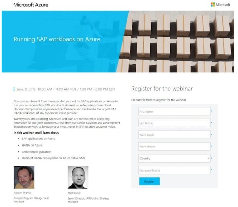
- Microsoft - Create an Azure Account
Microsoft has many Sample landing pages, and "Create an Azure Account" is one of the best. The headline is clear, and when a prospect lands on this page, they know what to do. At the top of the page, the prospects also see the value proposition of creating an Azure account.
The page also includes a GIF showing the prospects how Azure will appear on their screens. The other thing that stands out about the page is the visual symbols and bullets highlighting the benefits of Azure, which the prospects can see at a glance without reading through everything. The CTA colour stands out, encouraging and showing prospects where to take action.
- Zoom - Customize Your Company's Zoom Page
Zoom provides videoconferencing services to tons of businesses in multiple sectors. While Zoom's core business is videoconferencing, they are also keen on positioning themselves as a branding partner.
Businesses can customize their Zoom webinar registration pages to match corporate colours, event banners, and company logos. They provide users with a customization feature that helps them create branded Zoom pages.
This great landing page works because it has a conspicuous headline that tells the users what they can do on the page. A GIF gives the users a sneak peek of their customized and branded Zoom pages.
Customization features are highlighted using icons and bullets, effortlessly showing the users what they can do with the feature. There is social proof of how the customization feature works and testimonials from other users talking about their experience with the service and encouraging others to try it. The size of the CTA button contrasts with the other page elements, making it stand out and clickable.
Conclusion
These Great Landing Page Examples are the unsung heroes of digital marketing, wielding the power to transform casual visitors into loyal customers and avid subscribers. Marketers can create landing pages that captivate and convert by adhering to design principles, learning from exemplary examples, and embracing optimization techniques.
Whether you're seeking to showcase products, capture leads, or promote an app, the art of the landing page is a crucial skill for driving success in the dynamic realm of digital marketing. So, embark on your journey to crafting captivating landing pages, and watch as your conversions soar to new heights.
People also read:

I'm fascinated by the IT world and how the 1's and 0's work. While I venture into the world of Technology, I try to share what I know in the simplest way with you. Not a fan of coffee, a travel addict, and a self-accredited 'master chef'.